

Spin Dashboard
Overview
Create an information tracking and data analysis platform to empower business-city collaboration.
Methods
Affinity diagraming, data visualization, storyboard, lo-to-hi fi prototyping
Background
Spin is an electric scooter-sharing company. It provides a scooter-sharing system controlled by a mobile app for reservations.

In the Interaction Design Studio class at Carnegie Mellon University, my team was tasked with creating a digital info platform used by both data analysts at Spin and policy analysts at City of Pittsburgh Department of Mobility and Infrastructure.
My Role
As the lead UX designer of the team, I closely collaborate with my teammates: Salonee Gupta (visual designer), Rob Lambeth (UX researcher), Ahana Mukhopadhyay (Content writer). While I contributed to all steps of the project, my main contribution was defining user experience and creating prototypes.
Problem
The current data communication between Spin and the city of Pittsburgh is both fragmented and labor-heavy. An effective real-time information tracking and data analysis platform need to be established to empower closer future collaboration.
Solution
A data driven dashboard with modular components, allowing users to mitigate analyze mistakes and amplify effective collaboration.
Research
Phase 1: Understand The Users
I kicked off the research by creating user archetypes for both the data analyst and policy analyst. In order to examine accuracy of assumptions and to eliminate potential biases, I conducted interviews with 5 participants related to the domain to list out the top goals.

Based on literature research and user interviews, I created a venn diagram to show users’ unique interests as well as common interests that should be addressed through the design solution.

Key Insight
Although access to all data at all time is wanted by the users, the type of information users need is highly subjected to scenarios or tasks at hand.
Phase 2: Understand the Data
In order to understand what data is useful and what underlying information could be generated through the data, I requested an example file of Spin’s operational data on 2021-08-01. I identified multiple data that could be used to further generate patterns.
Besides that, I also took a look at Spin’s existing app for potential data collection triggers such as user feedback.

Three high impact data patterns for both Mia and Elliot:
1) Overall usage
Find transportation patterns and measure rider’s willingness to use the service
2) Scooter distribution
Ensure scooters are reasonably distributed to fulfill rider’s needs
3) Accidents and Injury
Track scooter-related accidents and understand the reasons to help reduce future risks
Phase 3: Create Future State Model
After understanding the current state, I wanted to bridge the gaps discovered while conducting previous researches by creating a future state model. Not wanting to scope down too fast, I focused on ideal access to data instead of an ideal design.

By first grouping individual data types into clusters and mapping between those clusters as well as each persona’s core questions, I was able to map an ideal future of data access. This also gave me a visual diagram to refer back to throughout the later design process.
Pre-Design
Design Principles
Before I started designing the dashboard, I established 4 design principles to help keep me on track.
1) Reduce Clutter
Both personas characterized their work as data heavy. Moving forward, I wanted to focus on clutter reduction so that the data weaves a coherent and clear story.
2) Prioritize user control & freedom
Everyone has a unique ability to potentially notice patterns and correlations that someone else might miss. The users should have ability to manipulate and interpret data in their own ways.
3) Speak user’s language
In order for the dashboard to be smart and to assist users with their work, it needs to speak the user’s language while also not restricting user’s ability to play with the data.
4) Focus on what’s important
While users have the freedom to explore, engage with and study all data, the dashboard should only alert users when necessary. Focusing on what’s important is the key.
Storyboard
I created a storyboard to illustrate some challenges Mia and Elliot face in a typical day to help set the tone for the dashboard design.

1. Mia, who works as a business analyst at Spin, gets into work at 9AM as usual.

2. Suddenly, Mia remembers she has an important meeting with her manager where she needs to present new insights.
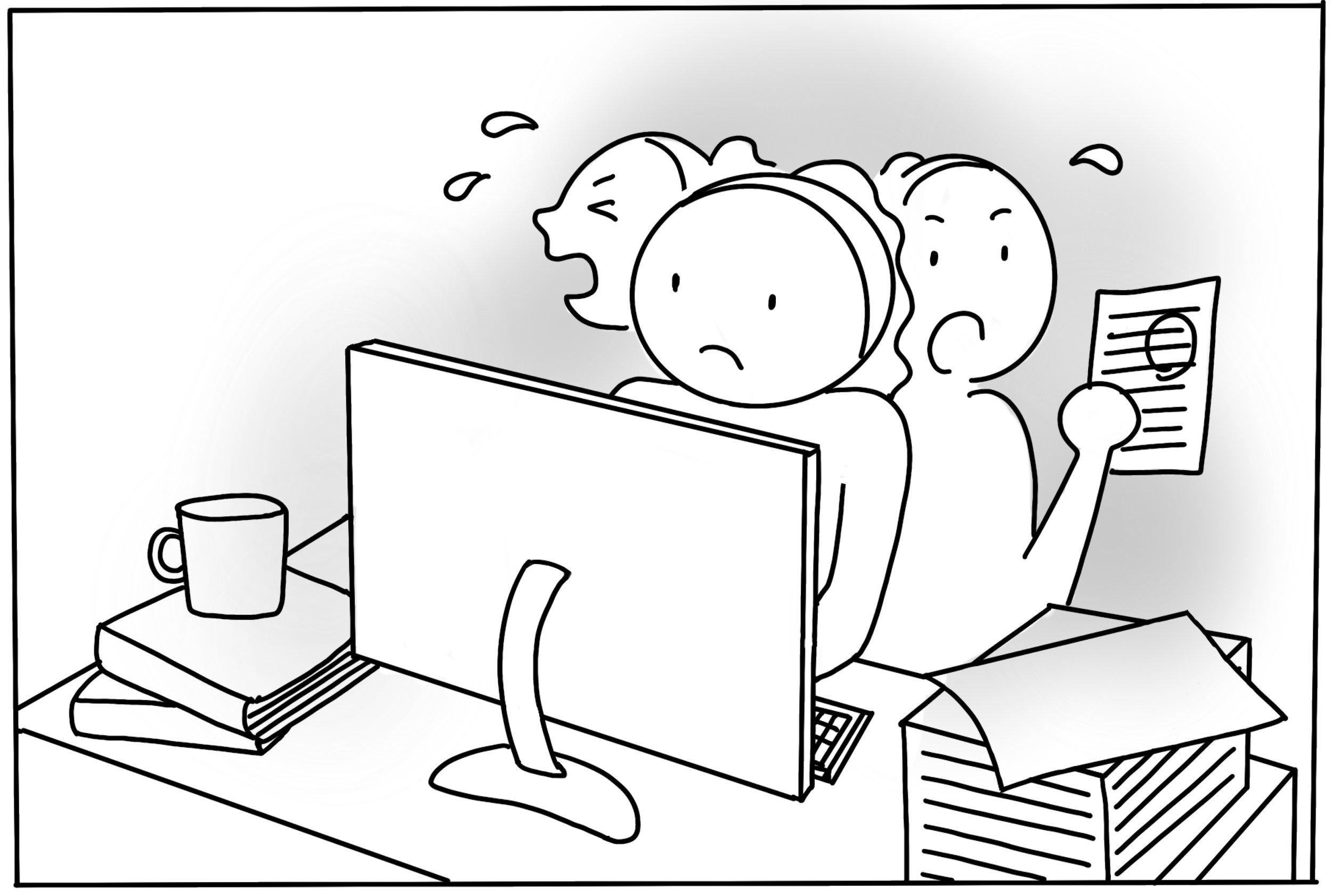
3. She has no choice but to spend hours looking through spreadsheet upon spreadsheet, trying to find a useful document.

4. Meanwhile on Elliot's way to work to the city department of transportation, two college-age students on SPIN scooters zipped by them, almost hitting an elderly lady on the sidewalk.
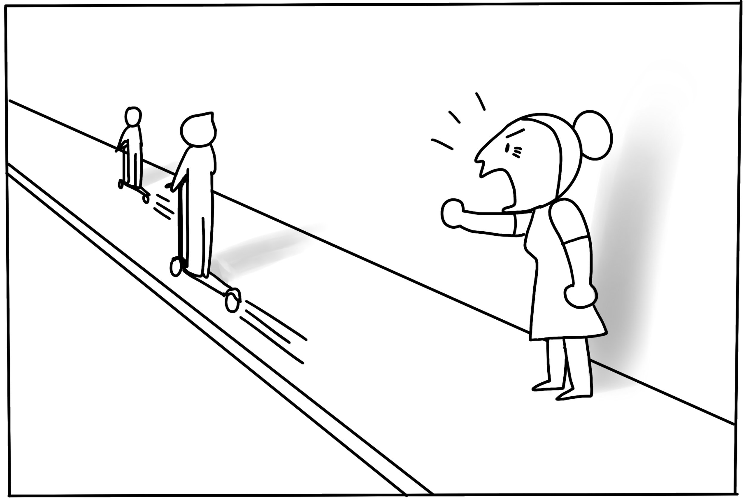
5. She yelled at the students, “I despise SPIN scooters! No one here uses these scooters, it’s only reckless college students passing through my neighborhood.”

6. Elliot want to understand if what they saw on the street is representative of the neighborhood. They try to get in touch with Mia but she isn't picking up.
Design Iterations
Lo-fi Prototype
The very first sketch focused on a neighborhood based layout. The left side indicated selection of the neighborhood while the right side was filled with sections of dashboard. I soon realized that it looked visually dense and cluttered - which lead to difficulty understanding.

I then switched to using bigger info graphs and visualizing the data. This helped clear up clutter in the dashboard. Meanwhile, I started to introduce the concept of modules to prioritize information and give users freedom to customize their screens.

Mid-fi Prototype
Moving up with fidelity, I made a couple of design decisions to better assist users with their daily work tasks.
A “For You” bulletin board was created to show realtime updates that’s worth notifying. The data are analyzed and visualized in the form of cards which could be reorganized by dragging them around the dashboard. On each card shows a high-level insight about the information displayed. An expand button is available on each card if users want to take a deeper look into the information. An export button is also available on each card for sharing purpose.

Based on feedback from user testing, the mid-fi prototype fulfilled the goal to keep users informed and presented the data in a more effective way. However, it also had some shortcomings that need to be solved. As a result, I decided to :
1) Introducing color palette to better show urgency and make critical data points more visible.
2) Use motion to show dynamic changes to data.
3) Adjust information density by changing overall layout from 3 columns to 2 columns.
Motion and Color
In order to introduce dynamic changes to data, the first thing I did was to update the color scheme to introduce stronger contrast as well as to indicate urgency.
Different shades of blue are used to represent neutral information with certain hierarchy. Red means negative, indicate high urgency due to radical changes of data. Green means positive, shows improvement such as high value growth or excellent risk control.

Motion and Control
I chose to incorporate multiple motion controls in the design. All of these controls allowed to pack more information in the same space through progressive disclosure without increasing the density of any card.
1) Dropdown

2) Hovering

3) Zoom In & Out

4) Easing In & Out

5) Card Setting

Final Design
Final Dashboard
The final dashboard design was simplistic yet still data rich with a combination of thick data and big data.

Design System

Result
Interactive Prototype
The MVP is an interactive dashboard designed for stationary screens. Setting on each card could be adjusted to reveal changes in data. Other motions are time based or activated by micro interactions.

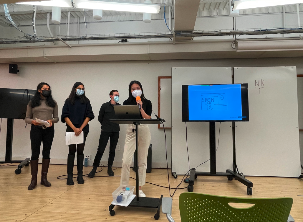
Pitch Presentation
At the end of the project, I delivered a 10 minute pitch with my teammates to cohort form the program and stakeholders from the company. We introduced the design rationale and conducted a live demo.
Process Book
In order to allow viewers to see the progression of this project from beginning to end, I designed a process book. It documented the backstory of this project which includes research, design iterations, and milestones.
